One of my favorite visualizations are Chernoff faces because they allow you to incorporate many attributes into a single visualization. Compared to a bar chart (which only displays one attribute), you can get a ‘full picture’ of the situation in a single iconic image (pardon the pun). Further, faces are a natural recognizable characteristic (for us humans) and this a fair bit of evidence to suggest you notice things in faces a lot easier than bland representations as a result of our social upbringing. This post is about implementing Chernoff faces in Power BI (through R). Firstly (in this post), I will the infamous crime statistics demonstration, and in the second post, I’ll show child faces against different dataset (Northwind) which incorporates normalization.
If you are not familiar with Chernoff faces, you can read more about them at Wikipedia here but basically they use facial characteristics to display an attribute value. For example, the size (height) of the face may be related to income, the width of the face might be related to quantity with the size of the eyes related to margin.
Chernoff implementation in R
I will include only a snippet of R required to show Chernoff faces (and then the output). A more complete tutorial can be found here and here. Basically, we need to install the library, get some data and then display the visual. This can be done with the following snippet;
install.packages(“aplpack”) # install the package
library(‘aplpack’)
crime <- read.csv(“http://datasets.flowingdata.com/crimeRatesByState-formatted.csv”) #get the data
faces(
crime[,2:8]
,face.type=0
,scale=TRUE
,main=’Crime Stats USA’
,labels=crime$state
,print.info=TRUE
) #plot the chart
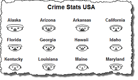
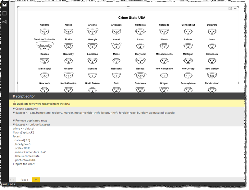
We then get the face visual (as below)
Chernoff implementation Power BI
In Power BI, there are a few things we need to do. These are;
- Setup Power BI for R
- Get our data (or build our model)
- Add the visualization (by)
- Telling the R (custom component R visualization what data to use) and
- Use R code to create/format the visualization
These steps are followed below;
1. Setting up Power BI for R
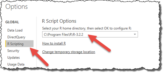
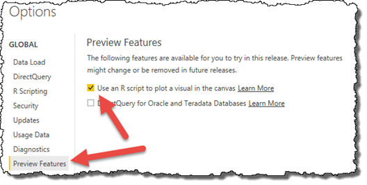
Before you can use R in Power BI, you need to install that are is installed on your local machine and that you have set and enabled R’s working directories in Power BI. To set R options in Power BI use the File > Options and settings > Options menu path. You can see that the directory of R needs to be set and you need to allow R to plot a visual in Power BI (this is a preview feature). I’ve included these images show the both the R directory setting and the use of R to plot visuals.
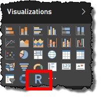
Once these features are enabled, you should see the R icon appear in your Visualisations pane (note that you’ll need to restart Power BI if you enabled R as in the above checkbox).
2. Get Data
Usually we expect to have a data model in Power BI (that is, we have imported some data, built a model and now we want to visualize it). For this demo though, I want to import the same data set that I used in the above snippet so I can use the R Script data source in Power BI. Here, all I have to do is choose the R source (accepting that this is a preview connector), and paste the R (read) script into the R dialog that Power BI Shows. This is shown in the 2 images below;
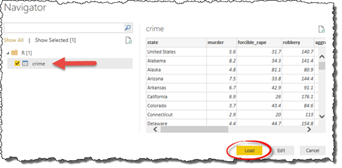
After this occurs, Power BI opens up the Data Navigator and you can either Load or Edit the Import query. I’ll just Load it (as shown below)
3. Add the Visualization
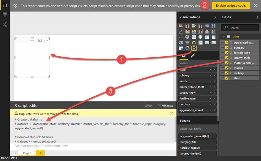
Once we have data in our Power BI workbook (you’ll notice that we have a crime table), all we need to do is;
- add the R visualization to the page canvas
- enable the script component (after all its custom component)
- add the data (that the visualization uses) and
- code the visualization (in R). Note that the data available in R code (ie the data frame) is defined by the data that was added in the prior step.
I have tried to show all these steps in the image below. One thing to note about adding data to the visualization is that the order in which you add fields (from the model) defines the columns that are in the data frame. This is important (for the Chernoff faces in R) because the first fields of the data frame defines the axis (grouping) of faces. Note that you can also see this order in R script editor in Power BI (the code is in the image below and un-editable in Power BI but looks like # dataset <- data.frame ( columns )).
You may recall (from the R script above) that we referred to crime as a data frame in R when we built created the code in R. In Power BI however, the data frame is referred to as dataset so in order to use our original code, we need to either create a new data frame in R (called crime) or change our existing R code to use a data frame called dataset. I’ll go with the first option and paste the following code into the R script editor (where you see ‘Paste or type your R-script code here).
crime <- dataset
library(‘aplpack’)
faces(
dataset[,2:8]
,face.type=0
,scale=TRUE
,main=’Crime Stats USA’
,labels=crime$state
,print.info=TRUE
) #plot the chart
In order to change the visual (while still editing code), just press the run button (in the R Script editor). My Power BI screen now looks like the following;
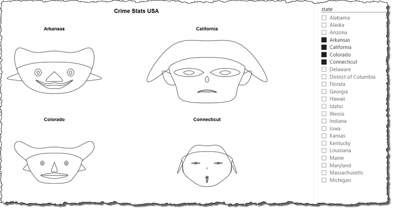
Of course the great thing about Power BI is that there is automatic filtering among visuals on the page. The next thing to do is add a slicer for state and allow the user to select what states to show. The R visual updates automatically. Doing this we can easily build a visual that allows the user to select and compare the faces of the states they select (as below).


Nice post, Paul!
A very good example how to extend the PBI functionality with the power of R.
Nik P.